
The Hidden Struggle Behind Finding the Perfect Brand Identity
Have you ever stared at a blank screen, frustrated because your business needs a professional logo but your bank account says no? I get it. I used to think I had to spend thousands to look like a real brand. The good news? You can actually build a stunning visual identity on a tiny budget without feeling overwhelmed, and I am going to show you exactly how to do it.
Starting a new business is one of the most exciting journeys you can take. But very quickly, a major roadblock appears right in front of you. You need a logo that perfectly represents your vision, but you simply do not have a massive budget to hire an expensive design agency.
Here is exactly why relying on bad information hurts your progress:
- Wasting valuable time: You spend days trying out complicated software that requires a degree in graphic design just to draw a simple circle.
- Hidden fees and scams: Many platforms promise a free design, but then lock your final image behind an expensive paywall right at the end.
- Generic results: Following poor advice often leads you to use overused templates, making your new business look exactly like a hundred other cheap companies.
- Legal nightmares: Some bad tutorials tell you to just copy things from Google, which can lead to massive copyright lawsuits later down the road.
This continuous cycle of frustration does a lot of damage behind the scenes. It is not just about a picture; it is about your mental peace.
Here is how this struggle silently destroys your confidence:
- Imposter syndrome sets in: When your graphics look amateur, you start feeling like an amateur, making you scared to promote your own services.
- Paralysis by analysis: You become so overwhelmed by the thousands of color choices and fonts that you end up doing nothing at all.
- Loss of momentum: That initial spark of excitement you had for your startup slowly fades away because you are stuck on one visual task.
- Financial anxiety: You might feel pressured into funding your initial startup costs without heavy risks just to pay a designer, putting unnecessary debt on your shoulders.
We have all been there, and it is a terrible place to be. But thankfully, modern technology offers a much better way to handle this.
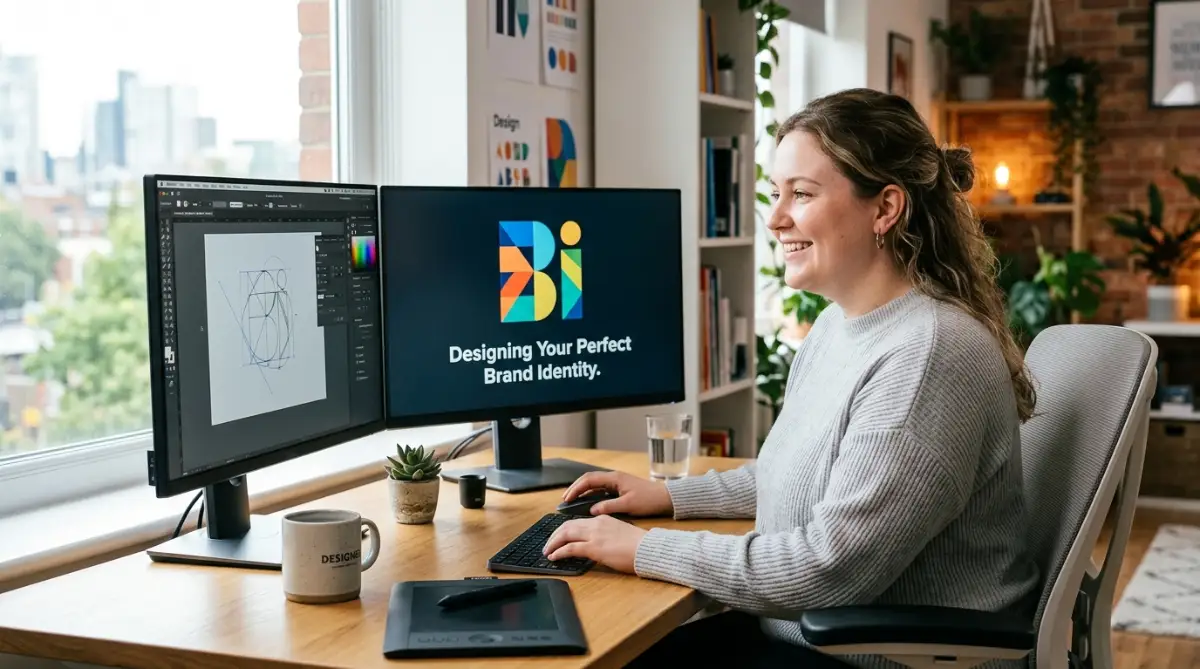
Quick Summary: What You Will Learn Today
- How to figure out your brand's true personality before touching any design software.
- The exact formula I use to talk to automated generators to get stunning results.
- Why you absolutely need a "vector" file (and how it saves you money in the long run).
- The top five newbie mistakes that instantly make a new business look cheap.
Defining Your Unique Brand Personality
Before we touch any software, we need to understand what makes your business special. Think of your brand as a real person. If your business walked into a room, how would it speak? How would it dress?
These are the exact questions you must answer before creating anything visual. A strong brand identity relies entirely on a clear personality. If you skip this phase, even the smartest computer program will give you a messy, confusing result.
Imagine you are opening a high-end coffee shop. You would not want a logo that looks like a discount toy store. You need elegance, warmth, and sophistication.
Start by writing down three simple adjectives that describe your company. Are you bold, modern, and fast? Or are you traditional, trustworthy, and calm?
Next, think about your ideal customer. A design made for a teenage gamer will look completely different from a design made for a retired investor. Your visual identity must speak directly to the person holding the credit card.
Myth vs. Fact: Creating Your Brand Identity
- Myth: You have to hire a pricey agency to look professional.
- Fact: With the right instructions, automated tools can create base designs that compete with top agencies.
- Myth: Your logo needs to show exactly what you sell.
- Fact: Think about Apple or Nike. Your logo just needs to capture your brand's vibe, not your exact product!
Once you have these words written down on a piece of paper, you have successfully built your foundation. This small exercise saves you dozens of hours of trial and error later on.
Choosing the Right Automated Generator
Now that you know your personality, it is time to pick the right engine for the job. There are dozens of platforms out there, and choosing the wrong one can easily lead to a massive headache.
You want a system that understands natural language. This means you can type exactly what you want, just like you are talking to a human friend. If you want to explore different options, discovering excellent automated design platforms can help you compare what is currently available on the market.
When testing a new platform, always check if they offer high-resolution downloads. A beautiful image is completely useless if it turns blurry when you print it on a business card.
Look for tools that allow you to revise the image multiple times. You will almost never get the perfect result on the very first try. You need an interface that lets you make tiny adjustments without starting over from scratch.
Also, consider the ownership rights. You must read the fine print to ensure you actually own the final artwork. Some free platforms keep the commercial rights, meaning you cannot legally use the image to sell products.
By taking ten minutes to read their terms of service, you protect yourself from massive legal trouble in the future. Treat this step seriously, as it forms the legal backbone of your visual identity.
Crafting the Perfect Text Command
I used to make the huge mistake of typing super long, confusing paragraphs into the generator, which only gave me messy and unusable pictures. I finally realized that keeping my commands short, specific, and focused on just two main colors completely changed the game for my brand.
The absolute secret to getting a stunning result lies in how you talk to the machine. We call this writing a prompt. The computer is incredibly smart, but it cannot read your mind.
If you type something simple like "make a dog logo," the computer will guess what you want. It might give you a cartoon dog, a realistic dog, or a geometric dog. You must remove all the guesswork from the equation.
Watch this quick video to see the exact formula I use to write my best prompts, and then keep reading below to master this smart skill for yourself!
Instead, try using a specific formula: Subject + Style + Color Palette + Background. Let us break this down with a real-life example.
Imagine you run a modern tech startup. Instead of saying "tech logo," you should write: "A minimalist geometric fox, futuristic style, neon blue and dark grey color palette, clean white background."

Notice how specific that is? The more details you provide, the better your final result will be.
You should also mention things you absolutely do not want. Many programs allow you to use negative prompts. If you hate the color red, simply type "no red colors" in the negative prompt box.
Think of yourself as a movie director. The computer is your camera operator. You must tell it exactly where to point, what lighting to use, and what mood to capture.
Do not get discouraged if the first five pictures look a bit weird. This is completely normal in the digital art world. Simply tweak your words, change one adjective, and try again until the magic happens.
Refining and Polishing Your Artwork
Getting a great image out of a generator is only the halfway point of your journey. The raw output is rarely perfect enough to slap onto a billboard or a website header.
You will often notice tiny strange details. Maybe a line is slightly crooked, or there is an extra shape that does not make sense. This is where you step in and act as the final editor.
You can use simple, free photo editing software to clean up these small mistakes. Erase any random dots, smooth out rough edges, and make sure the background is completely transparent. A transparent background is essential so you can place your design over different colors without an ugly white box showing up.
Next, you need to think about typography. Many image generators struggle to spell words correctly. They might give you a beautiful icon, but the text underneath might look like complete nonsense.
The smartest approach is to generate the icon by itself, without any words. Once you have the perfect icon, you can add your company name later using a simple editing tool.
Choose a font that matches the exact mood of your icon. If your icon is sharp and futuristic, use a clean, modern font. Do not mix a traditional, fancy handwriting font with a high-tech robotic icon. Consistency is the main secret to making things look expensive.
The Secret of Vector Formats
If there is one technical thing you must learn today, it is the difference between a normal picture and a vector file. This single piece of knowledge separates amateur creators from real professionals.
Most automated tools will give you a standard image file, like a JPG or a PNG. These are made of thousands of tiny colored squares called pixels. If you try to stretch a small PNG file to fit on a large street banner, those tiny squares stretch out, and the image becomes a blurry, pixelated mess.
A vector file, on the other hand, is made of mathematical equations. This means you can stretch the image to the size of a giant building, and it will remain perfectly sharp and crisp.
For a professional brand, you absolutely need a vector version of your artwork. Many online converters can take your flat image and turn it into a scalable vector file (usually an SVG or EPS format).
Once you have this magical file, you can hand it over to any printer, web developer, or merchandise maker in the world. They will instantly know you mean business.
Quick Comparison: Why Vector Always Wins
It also makes it much easier to change colors in the future. If you decide to update your brand colors five years from now, a vector file allows you to swap colors with a single click.

Long-Term Maintenance for Your Brand Assets
Creating the design is a huge achievement, but keeping it organized is just as important. Many beginners lose their original files because they save them randomly on their messy computer desktops.
You must create a dedicated brand folder on a secure cloud drive. Inside this folder, keep every single version of your new asset. Have a folder for the transparent PNGs, another for the scalable vectors, and a separate one for the black-and-white versions.
Yes, you need a black-and-white version. Sometimes you will need to print documents without color ink, or engrave your design onto a wooden product. If your artwork only looks good in full color, it will fail these simple real-world tests.
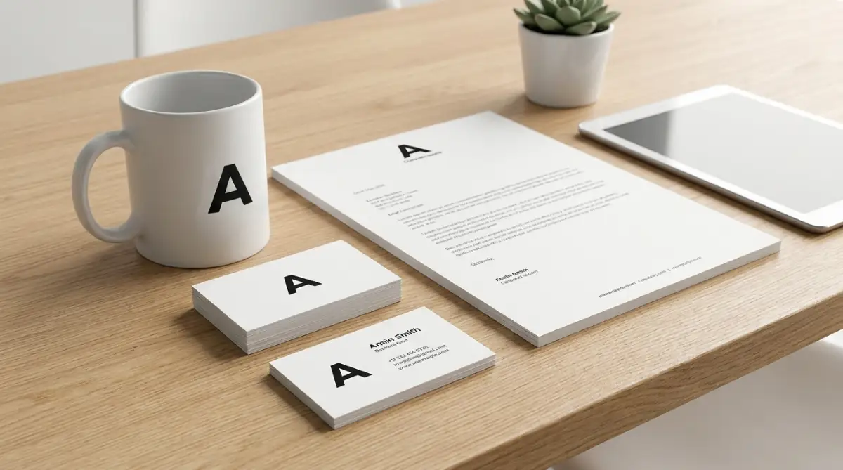
You should also write down the exact color codes you used. These are usually six-character codes, like #FF5733. Keep these codes in a simple text document inside your brand folder.
When you build your website, you will need those exact color codes to match your buttons and menus to your new visual identity. If you are ever trying to build a serious company, perhaps even securing a solid financial foundation for your business, investors will notice these small professional details.
Organization might sound boring, but it saves you from massive panic attacks later. When a printing company asks for your source file with a one-hour deadline, you will be able to send it immediately.
Common Traps You Must Avoid
Even with the smartest technology at your fingertips, human error can easily ruin the final outcome. Many beginners fall into the exact same traps because they get too excited and rush the process.
Here are the five most dangerous mistakes you need to actively avoid:
- Making it too complicated: You might be tempted to add a mountain, a river, an eagle, and a coffee cup all into one single picture. This is a massive mistake. The best global brands use incredibly simple shapes. A complex image turns into a blurry smudge when shrunk down to fit a social media profile picture.
- Following temporary trends: Just because a specific neon color is popular on social media today does not mean it will look good tomorrow. If you chase short-term trends, your company will look completely outdated very quickly. Stick to timeless, classic principles.
- Ignoring contrast: If you put a light yellow icon on a white background, nobody will be able to see it. Always test your artwork in black and white to ensure the contrast is strong enough to read easily from a distance.
- Using too many fonts: Never use more than two different text styles in your entire visual identity. Mixing three or four fonts makes your company look messy, disorganized, and untrustworthy. Keep things clean and unified.
- Forgetting to test on mobile: Over half of all your customers will interact with your business through a small smartphone screen. If your design looks amazing on a giant computer monitor but is unreadable on a phone, it is a bad design. Always test your images on smaller devices before making them official.
Ignoring these rules can cause serious damage to your public image. You might spend months building a great product, only to lose customers because your visual presentation looks cheap or confusing.
Take a step back, look at your work with a critical eye, and simplify wherever possible. Simplicity is always the ultimate form of sophistication.
Stepping confidently into the market
You now have a complete, professional roadmap to handle your own visual presentation from start to finish. You understand how to communicate with smart algorithms, how to refine the raw results, and how to protect your assets for the long run.
This knowledge gives you a massive advantage over competitors who are still paying thousands of dollars or struggling with outdated software. By taking control of your own visual identity, you show the world that you are a modern, adaptable, and resourceful entrepreneur.
Whether you are starting a small local shop or securing premium funding opportunities for a new business, the way you present yourself matters deeply. You no longer have to feel embarrassed by amateur graphics or stressed by high design costs.
Take a deep breath, open up a smart design platform, and start typing your first prompt. Give yourself permission to experiment, make mistakes, and have fun with the process.
From my own journey, I can promise you that finally seeing your perfect brand come to life is one of the best feelings in the world. Do not let fear or small budgets hold you back anymore—grab these tools today and give your amazing ideas the beautiful look they deserve!
Your dream business deserves a beautiful face. Go out there and start creating something you are truly proud to share with the world today. The tools are ready and waiting for your unique vision.